0
1
2
3
4
5
6
7
8
9
0
1
2
3
4
5
6
7
8
9
0
1
2
3
4
5
6
7
8
9
The site features fun sound effects and animations to enhance your experience. By clicking Accept, you agree to our Privacy Policy and the use of cookies.

0
1
2
3
4
5
6
7
8
9
0
1
2
3
4
5
6
7
8
9
0
1
2
3
4
5
6
7
8
9
The site features fun sound effects and animations to enhance your experience. By clicking Accept, you agree to our Privacy Policy and the use of cookies.
Backstage
GrønnHugge
2024 — 2025
By Artem Shcherban in Articles on April 7, 2025
Creating impact through design directly translates to a brand’s success, market recognition, and ability to reach its targeted customers. Great design is not just about aesthetics; it is a powerful tool that shapes experiences and influences perceptions.
The success of Artem Shcherban and Andrey Vedernikov’s recent work positioning Norwegian outdoors brand, GrønnHugge, has earned three prestigious awards and gained recognition on top design blogs, showcases the profound impact of thoughtful design.
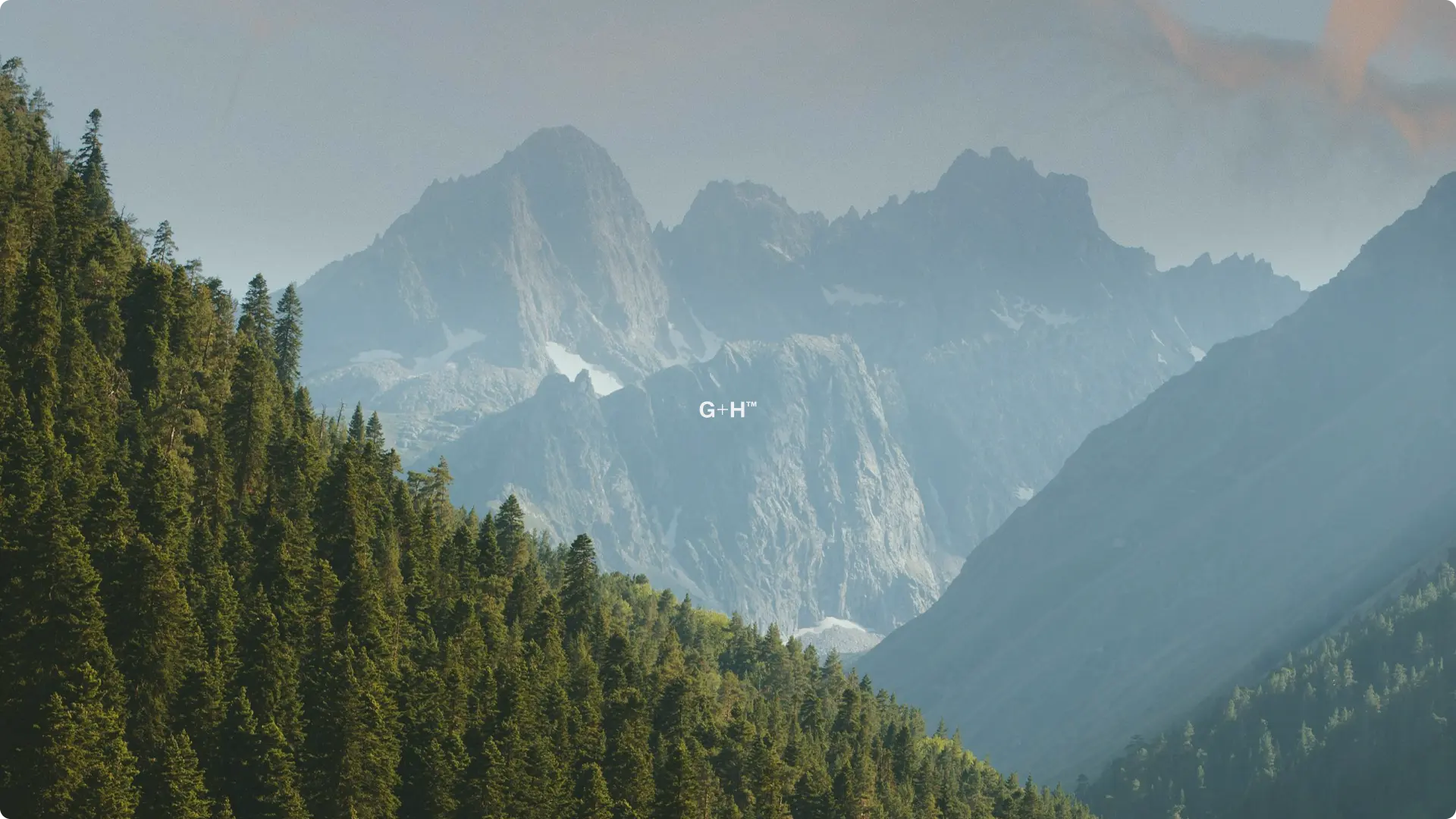
GrønnHugge, the Norwegian outdoors brand, is built on a foundation of sustainability, innovation, and a profound respect for the natural world. At its core, GrønnHugge’s ethos is about creating high-quality, durable gear that makes outdoor adventures not only accessible but empowers people to embrace the wilderness with confidence.
The brand recognizes that nature is both a source of inspiration and a responsibility, which is why they are deeply committed to eco-friendly practices. From using sustainable materials to designing long-lasting products, GrønnHugge strives to minimize its environmental impact while encouraging a lifestyle that harmonizes with the outdoors.
Whether it’s a long trek through rugged terrain or a peaceful camping trip under the stars, GrønnHugge’s gear is crafted to enhance the experience, offering a seamless blend of practicality and style ensuring that adventurers can focus on the joy of exploration without being hindered by unreliable or uncomfortable equipment.
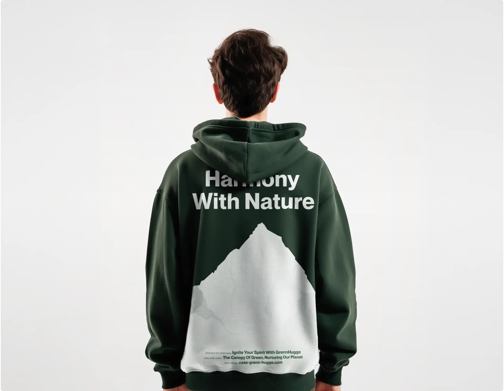
After analyzing the GrønnHugge brand and target demographic, Shcherban and Vedernikov aimed to conceptualize a brandmark that would be flexible, allowing for a dynamic transition between two forms: the full company name GrønnHugge™ and its abbreviated version G+H™. The choice of the shortened logo G+H™ was intentional, as it focuses on the symbolism of unity and connection between humans and nature. “Grønn” in Norwegian conjures images of verdant nature and “Hugge” is a take of the concept of hygge — a philosophy of well-being.
The corporate identity was crafted with a simple and straightforward design approach. The design is rounded out with intentionally selected eco-icons and a modern green color palette, ensuring a clear and consistent visual representation of the brand across all platforms. These eco-icons serve to immediately communicate the commitment to environmental values.
From a competitive analysis and market position perspective, the duo’s challenge was to present the GrønnHugge™ brand as friendly and customer-oriented as the target demographic was both professional and amatuer foresters. To this end, three core principles were incorporated into the development of the brand from the start: 1) showcase and value the natural world, 2) ensure positive tone keeping the approachability top of mind, and 3) communicate ease of use and functionality via a distilled, modern design.
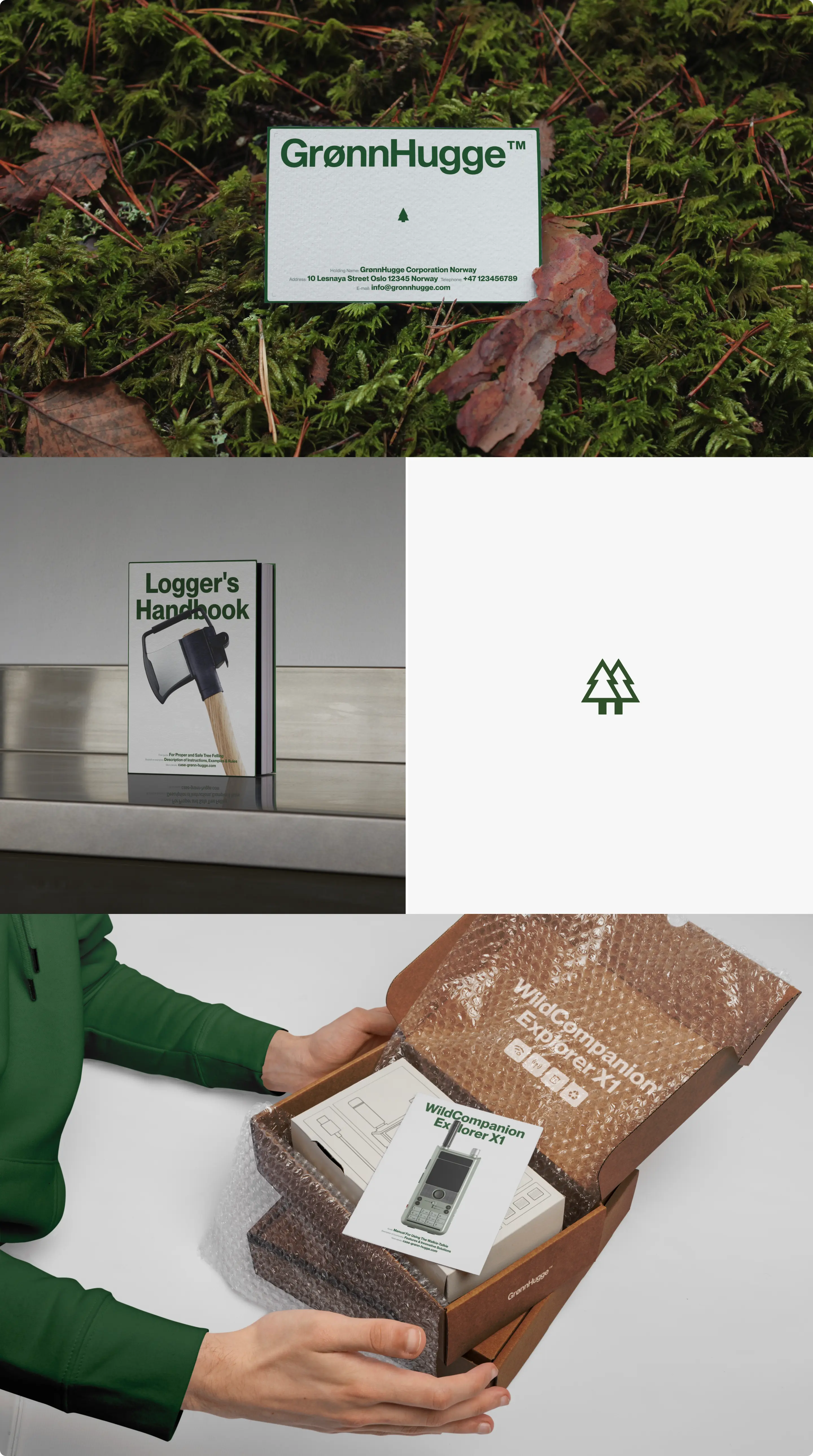
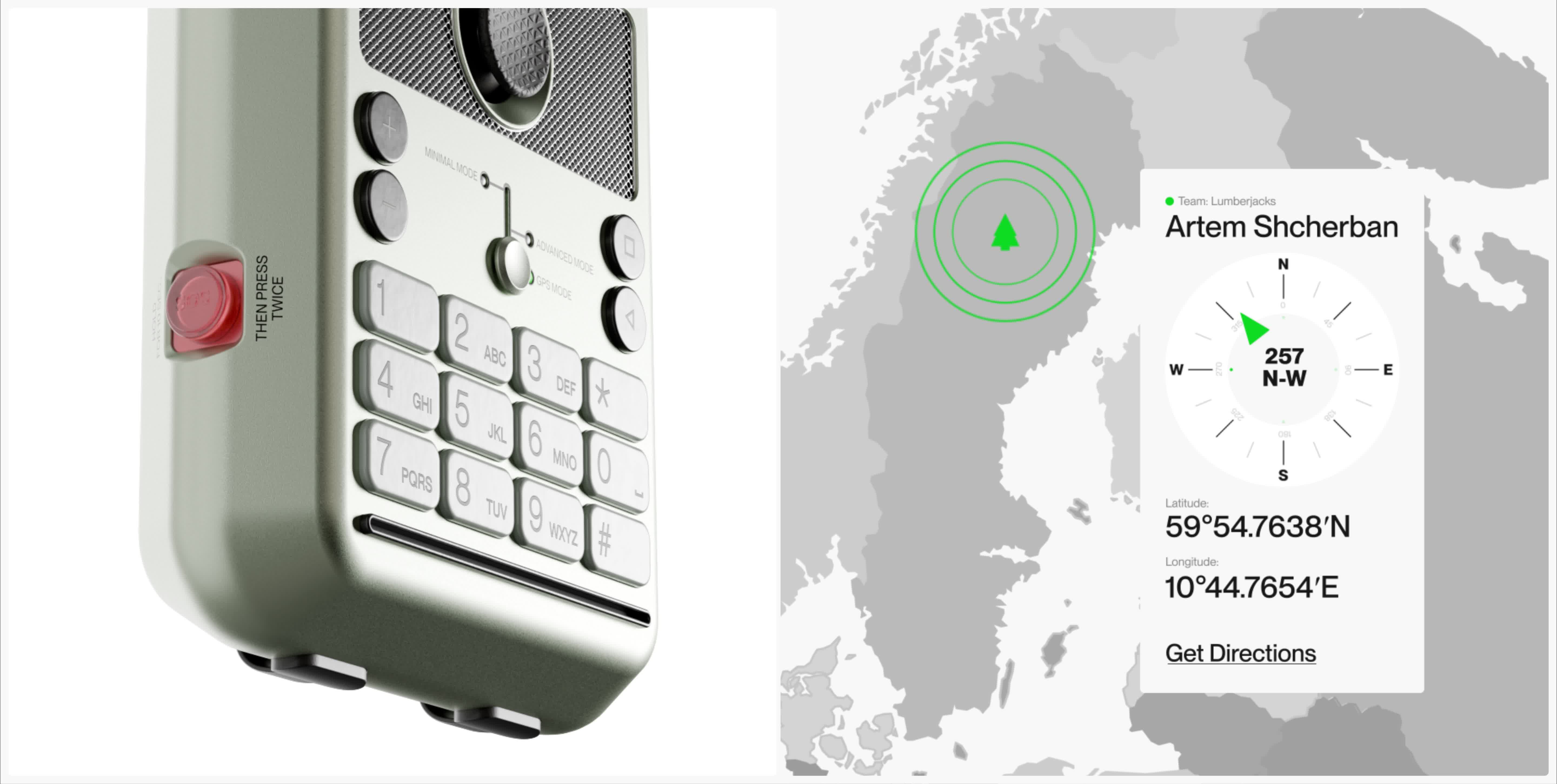
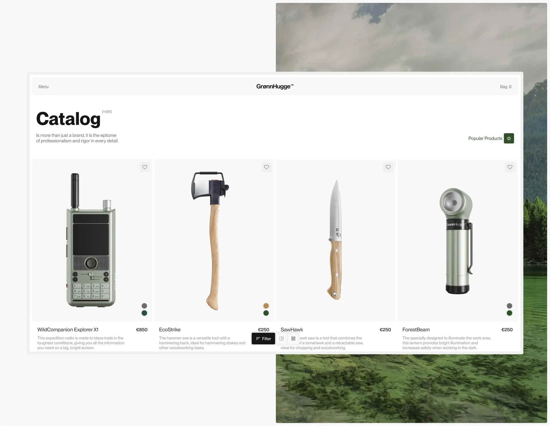
Shcherban and Vedernikov developed eight products for Grønhugge’s launch. The hero product — WildCompanion Explorer X1 — presents a unique market offering by combining communication and navigation into one compact device. From functionality to packaging, the WildCompanion Explorer X1 offers a great lens to look at the thought, detail, and technical design that the duo put into their work for GrønnHugge.

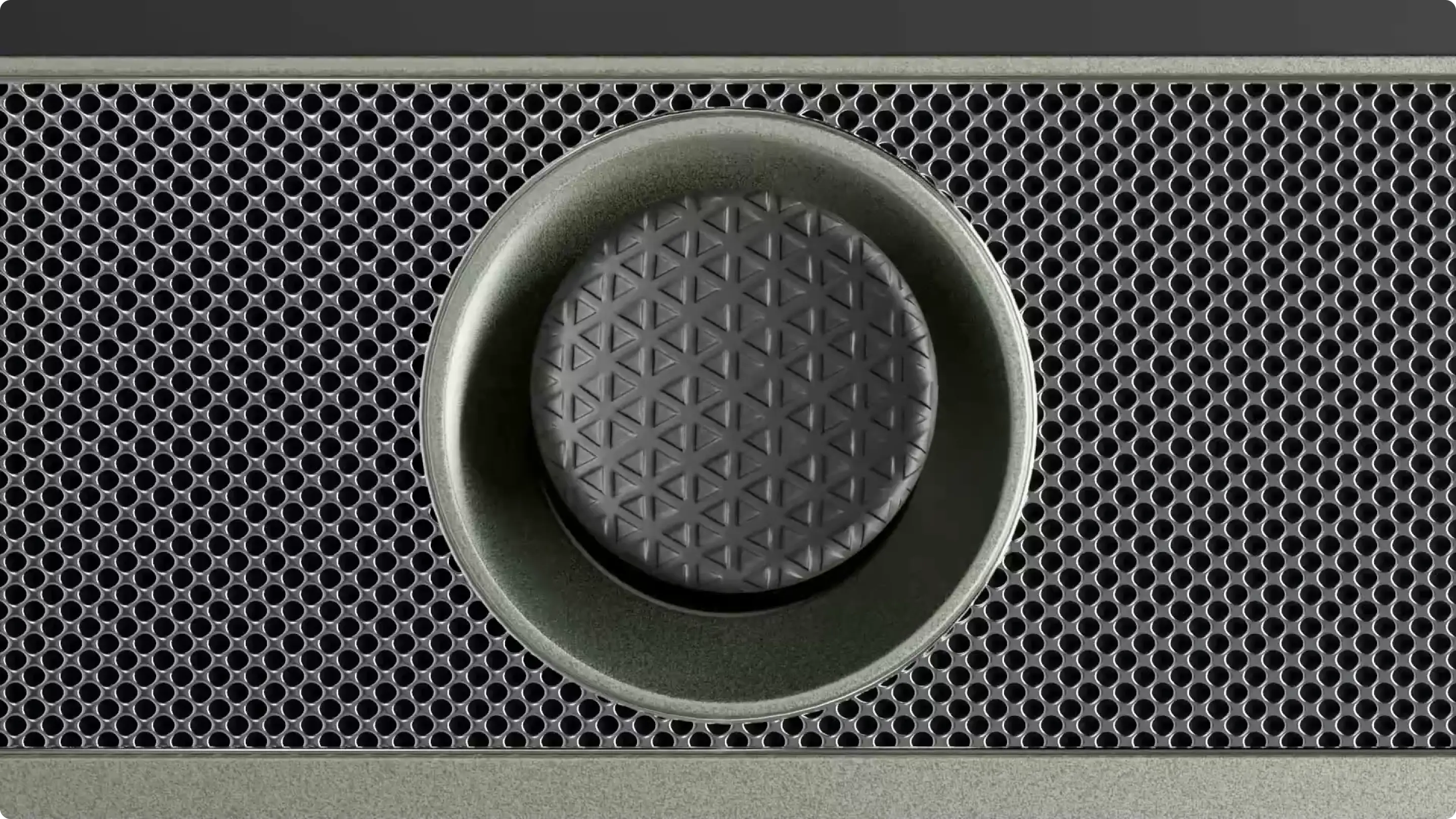
The WildCompanion Explorer X1 features a one-piece cast metal chassis that provides protection against water, dust, sand, and other environmental contaminants that the device will encounter thru its use. The device’s design allows for IP68 level of moisture protection, which corresponds to modern smartphones. The streamlined design of the walkie-talkie allows all controls to be compactly organized in functional groups optimizing intuitive use.
%201.webp)
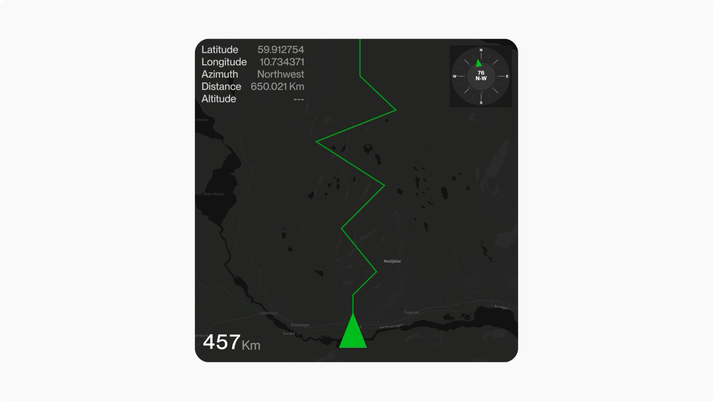
A central joystick opens possibilities for multi-functional control functions to increase the ease of use. This unique feature allows the user to navigate the device’s map interface when in GPS mode.
An important feature of the WildCompanion Explorer X1 is SOS mode which offers the ability to instantly send GPS coordinates and request help at the push of a button. Accidental press protection is built in to assuage fear of accidentally triggering a distress call.
The WildCompanion Explorer X1 features a 10,000mAh high capacity battery that is conveniently charged via USB-C and can be replaced with a charged spare by removing the back panel. For easy storage of downloaded maps and GPS routes, we have provided support for memory cards. The tray is accessed using a standard “paper clip”.
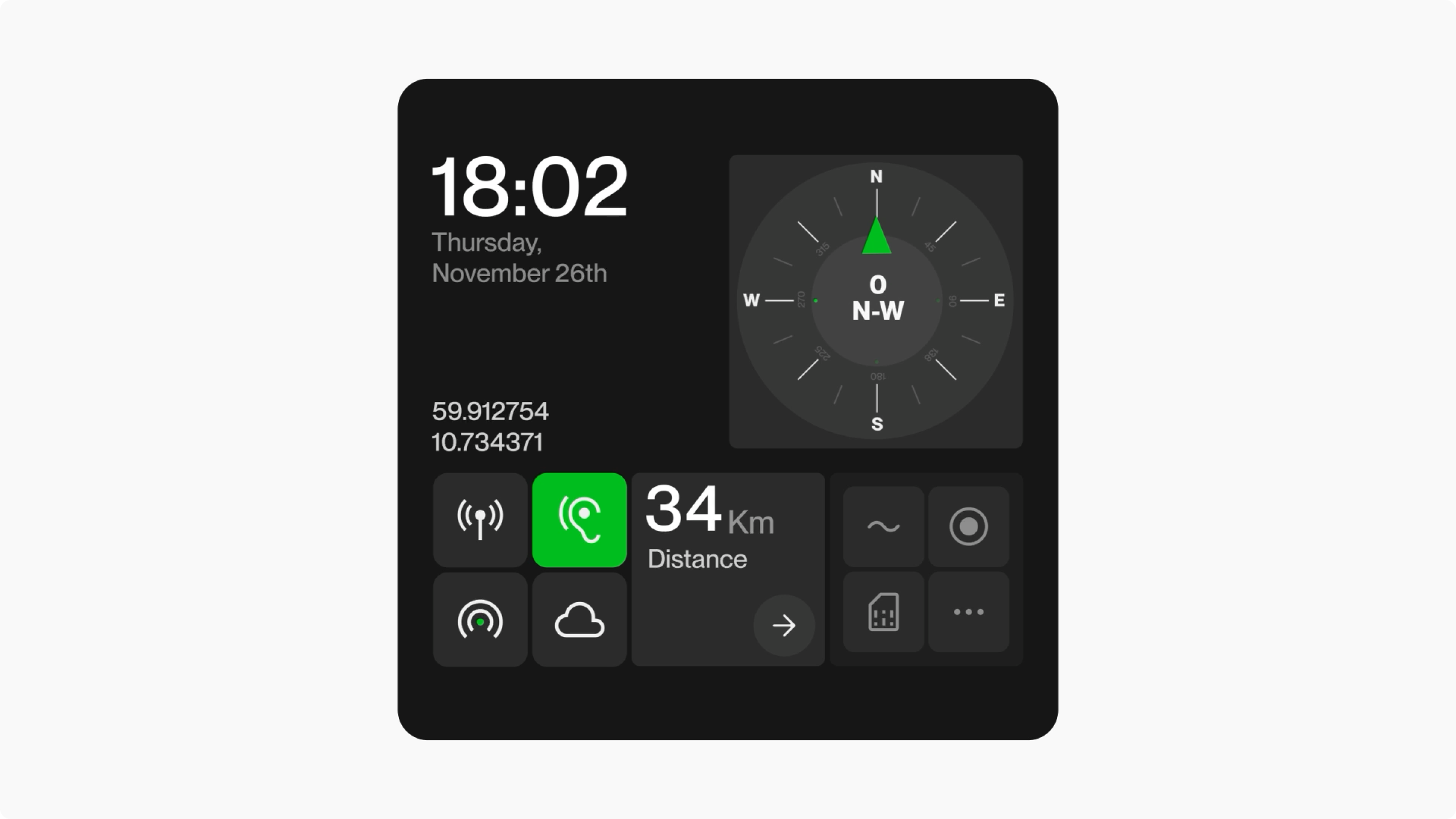
The device has an operating system with a basic settings screen and a list of applications and functions — ex: map saving, compass, cloud synchronization and shared command lists which make group expeditions easy to track tasks. The display features two modes: minimum and advanced.
Minimum mode: only the small top screen is active, which greatly reduces power consumption. All front buttons are locked and the device only works in walkie-talkie format controlled by the side buttons.
Advanced Mode: includes useful apps like weather and compass, Wi-Fi connectivity to your smartphone, walkie-talkie and GPS settings.
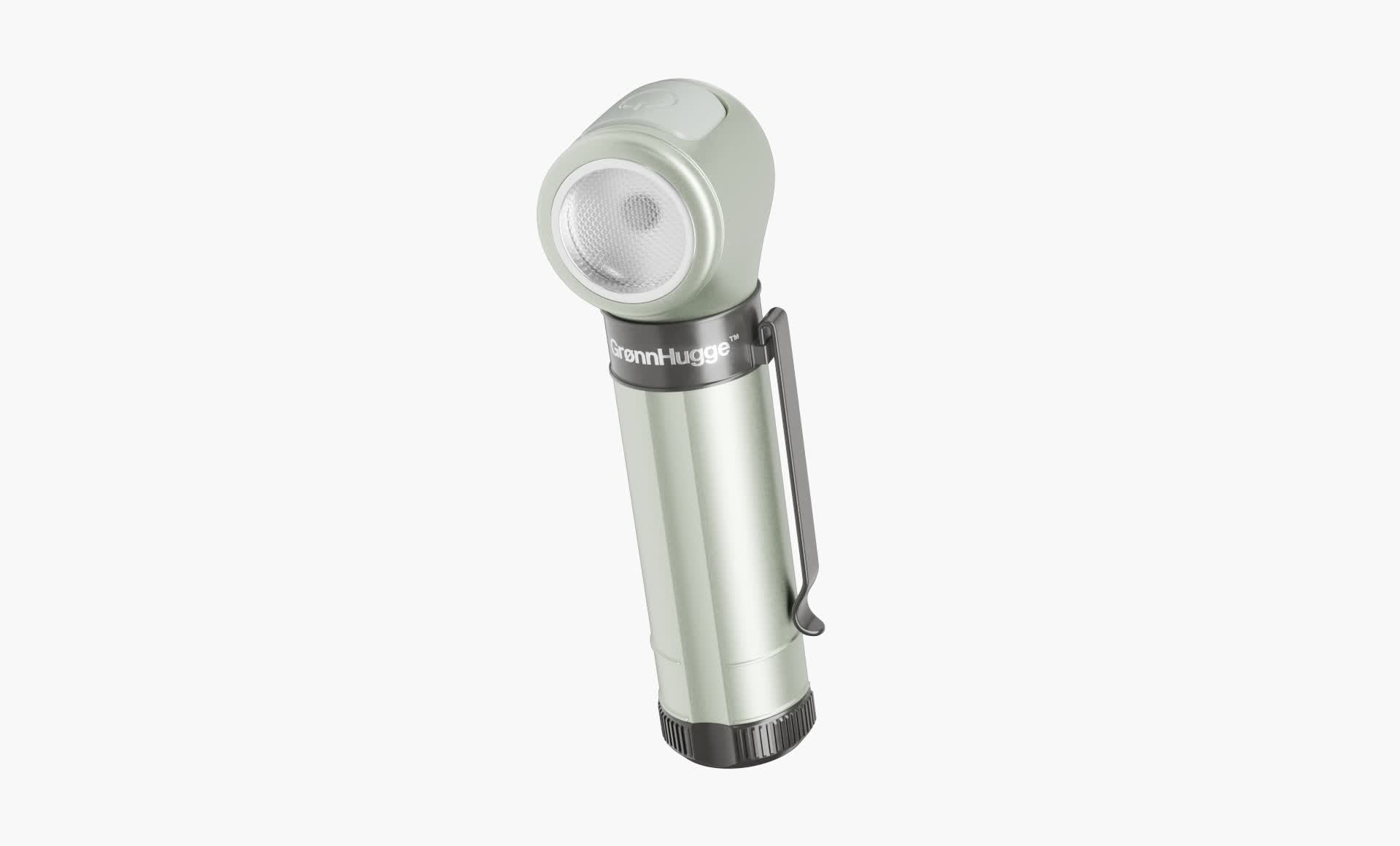
The ForestBeam flashlight is rugged and easy to use, providing reliability in even the most demanding outdoor environments. Designed with functionality in mind, it features forehead mount rails for hands-free operation, a multi-function button for easy operation, a mechanical switch to prevent accidental activation, and a magnetic port for fast and safe charging.
Developing the animation for the flashlight required working with an open source program, which presented unique technical challenges. This required the collaboration of a programmer to help, running the system with Python scripts to ensure a smooth effect.
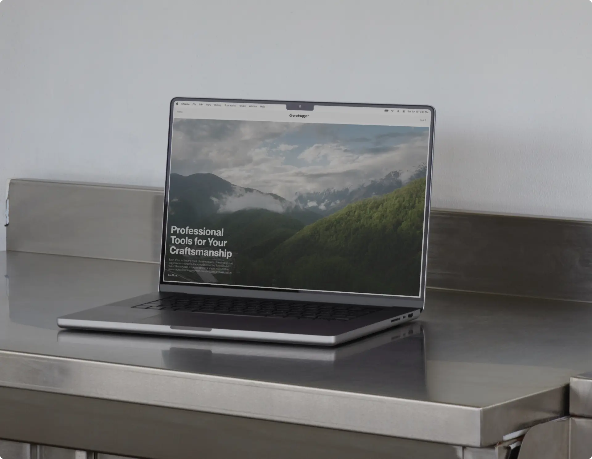
With the brand identity, market positioning, and product offering in place, the structure of GrønnHugge’s web presence mirrors the modern, streamlined approach. The design features a main catalog with a filter bar at the bottom of the page. The site embraces the brand ethos of encouraging more to explore nature and offers a community section with both company and user-submitted educational training content.
The GrønnHugge website reflects the brand’s deep connection to nature and features a variety of dynamic, high-quality photography and engaging videos. These visual elements are carefully selected to evoke a sense of adventure and a deep understanding of the natural world, reinforcing the brand’s mission to inspire outdoor exploration. The combination of real images and a minimalistic interface provides a fluid and engaging user experience, making the site both functional and emotionally compelling.

At the center of the product page is an interactive showcase designed to immerse users in the world of the WildCompanion Explorer X1 before they even pick it up. The device turns on as soon as the page loads, creating a sense of depth and engagement. Each feature and unique function is visually highlighted, providing a complete understanding of the product’s capabilities. This approach not only enhances user interaction, but also reaffirms the brand’s commitment to innovation and thoughtful design.
.webp)
The design of GrønnHugge’s website has been recognized across multiple platforms including being featured on Pangram Pangram’s Font in Use showcase and on Behance.
For more information about Shcherban and Vedernikov’s work on GrønnHugge and their current projects visit.


BACK
NEXT
